The Gloves Are Off and the Octopus Has Evolved
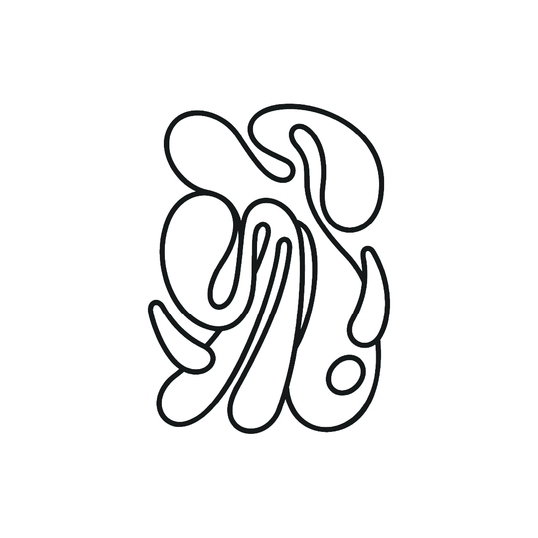
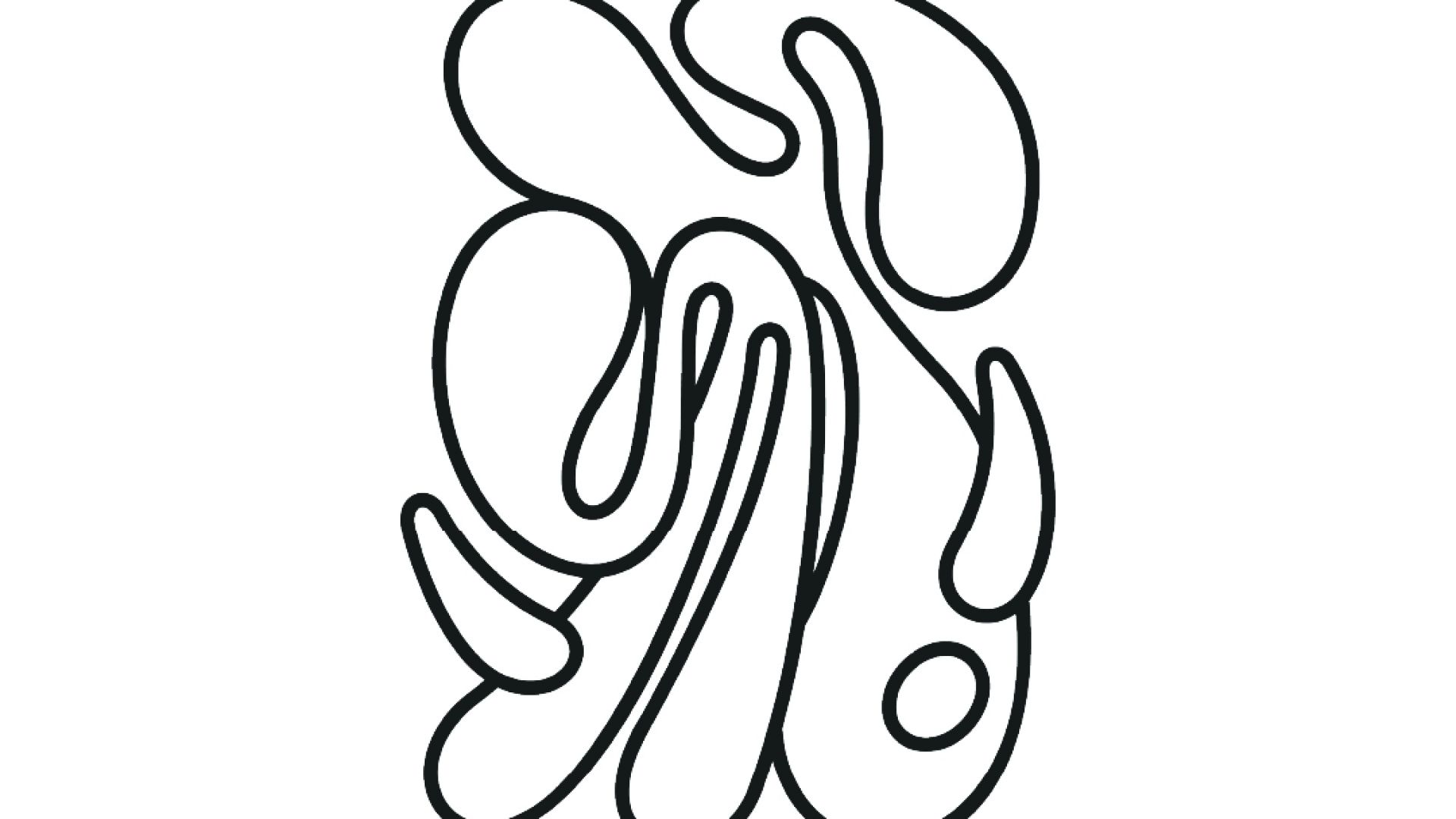
MullenLowe unveils its new global identity and a refreshed positioning, created to unite the network across 57 markets globally and differentiate it from competitors. MullenLowe sees the octopus evolve from an operational mascot to a kindred spirit that visually represents how brands need to grow today.

The agency’s positioning is underpinned by research revealing innovative brands grow at twice the pace of their competitors, and brands that continue to innovate grow seven times faster*.
“Our icon offers the perfect metaphor. The octopus has survived over 300 million years precisely because of its fluidity and ability to adapt. It is the only organism that routinely self-edits its own DNA—a model for how brands should behave today,” says Kristen Cavallo, CEO of MullenLowe Global.
The new brand identity was created by MullenLowe U.S. and led by head of design, João Paz.
“We want to challenge the way brands show up in the world. Our octopus is not afraid of change; it’s in its nature, its DNA. We embraced that with a fully generative identity, crafted to show personalization at scale,” says Paz.
The new logo doesn’t live by the rules of logic—and like the animal it portrays, has the capacity to adapt to its surroundings. It breaks free from any type of symmetry and rigidity. With no corners or end points, it changes and moves and behaves in different ways. “Our octopus is alive. It has a will, a personality, and, above all, it wants to move. With its endless twists and turns, it has the freedom to reinvent itself infinitely,” adds Paz.
True to MullenLowe’s challenger mentality, the new logo defies established branding tradition by being a living element. Unlike corporate logos that are bound by strict rules, the agency’s new logo encourages creative expression. Each tentacle can be moved and scaled to preference, and every person within the organization is encouraged to personalize the octopus and make it their own.
The expressive logo is paired with a stark, firm, and more logical wordmark custom-made by renowned German type designer Berthold Wolpe. It grounds the fluid shape of the octopus, as if to combine motion with reason.
“MullenLowe’s new visual identity reflects the ever-changing nature of our work,” shares Mike Trillana, Chairman and CEO of MullenLowe TREYNA. “There are infinite variations that can be generated by every single person that is part of MullenLowe. This dynamic feature represents the fluidity and creativity that it takes to be a challenger in the industry.”
*Source: Kantar BrandZ


